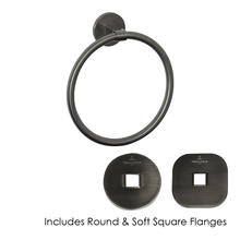
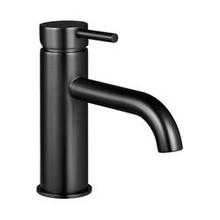
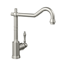
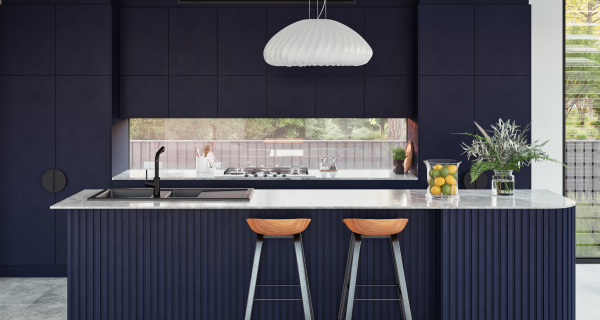
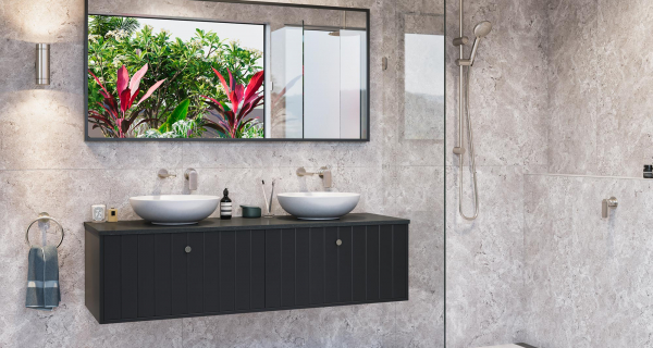
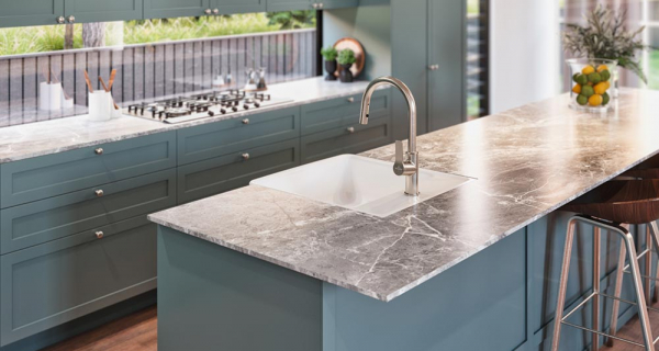
Shapes address the subconscious. They can be used with purpose to create exciting room presentations
Like colours, shapes are also first perceived at a subconscious level – provided they do not move into the foreground as the result of a particularly bold aesthetic. With this trait, the geometry of objects can be used to enhance the concept of an interior or to add accents to it.
It’s a well-known fact that shapes affect us. Why this should be so is quite an interesting question, and it’s one that Gestalt psychologist Wolfgang Köhler already addressed in 1929. His field of research addressed the appeal of things and the interplay between haptic, olfactory, auditive and visual stimuli. Köhler invented two words: maluma and takete. He presented them to test persons and asked them to imagine objects that suited them. Ninety percent of all people associate maluma with a soft shaped and takete with something angular.
Conversely, the proven effect of geometries on the perception can also be controlled. This is not a new idea, even though it has different names in different cultures. The Romans and Greeks transferred the geometries in nature to their buildings, and mathematically derived the construction of the world from that. Feng shui tells us where shapes, materials and colours should be placed in order to encourage the life energy to flow, and for rooms to have a positive effect on us. And Bauhaus made the basic square, circle and triangle into the “grammar of Modernity”. Geometric shapes can be integrated in the interior on different levels, as furniture, fittings and accessories, patterned wallpapers or textiles. They are a tool for harmony and proportions, counterpoints and character. However, they also demand sensitivity.
Strong geometries only look tidy in minimalist interiors, where their clarity is seen at their best effect. They should be used sparingly in places where there is already an extensive mix of styles, materials and patterns, because an additional layer can quickly cause chaos here. It helps to form small groups in order to keep a perspective, with a selection of geometric objects being placed together to create a visual unit. And finally, the last rule – as is so often the case – is that rules exist to be broken. A good composition is often the result of instinct and emotional access to the room and object.
Symmetry vs. asymmetry
Symmetry enables the observer to understand an object more quickly: even half of something is enough for us to make a picture of the whole. The human brain likes symmetry, and it is also a part of the familiarity in nature: leaves, butterflies or other people – nature has constructed them all with axial symmetry. Regularity is pleasing and cosy. In order to achieve a harmonious effect, curves should be aesthetically logical, taking the course of a gentle wave or forming a regular ellipse. Abrupt changes in direction or formal breaks are seen as disruptive. This also applies to shapes, to three-dimensional forms. But by the same token, breaks in the right places can be seen as interesting. Asymmetrical shapes are the more exciting choice because they are seen as disruptive, and the eye tends to linger longer on them.
Setting accents


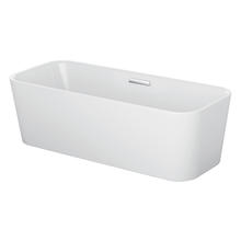
The BetteSpace bath breaks with orthogonal traditions, which makes it the creative focal point in the bathroom. What is particularly elegant about the design is that the trapezoid shape is not only formally interesting, but also makes optimum use of the room. Smaller bathrooms or layouts benefit in particular from the foot end.
Oval and organic
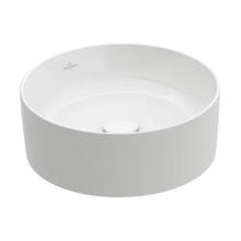
Round and organic shapes are seen as soft. The most regular is the circle, which is familiar to use from nature as a calming element – after all, from the sun to the moon and the stars, all the heavenly bodies in the sky are round. A circle has no beginning and no breaks – as objects with no beginning and no end, circles and ellipses stand for perfection. Thanks to their timelessness, they combine beautifully with angular shapes. The counterplay with geometries is particularly effective here.
Following in nature’s tracks


Bette’s biggest bath forms a perfect circle. BettePond has a fascinating and spectacular effect, especially if it is positioned freely in the room. Not only is the name a reference to natures; so too is its shape. This always becomes particularly clear if it positioned in places where building and architecture enter into a dialogue with each other.
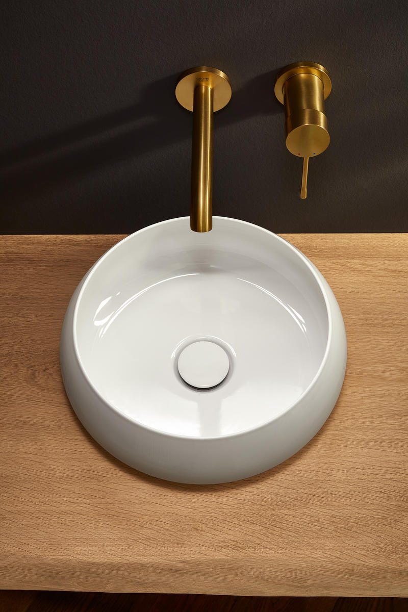
Like a hollowed-out pebble: the BetteCraft washbasin, designed by Tesseraux und Partner, combines a solid appearance with a delicate silhouette: The ultra-thin titanium steel shells are shaped by hand.

Strikingly edgy
Pointed shapes look dynamic, especially the triangle with its mythological associations. Squares are seen as strong and factual. We have a very special feeling for the regular square: it is the foundation of our home-building, and most of our rooms have four right-angled corners. Cuboids and rectangles radiate stability and endurance, and are perceived as having the maximum solidity.
Fitting a square into a square
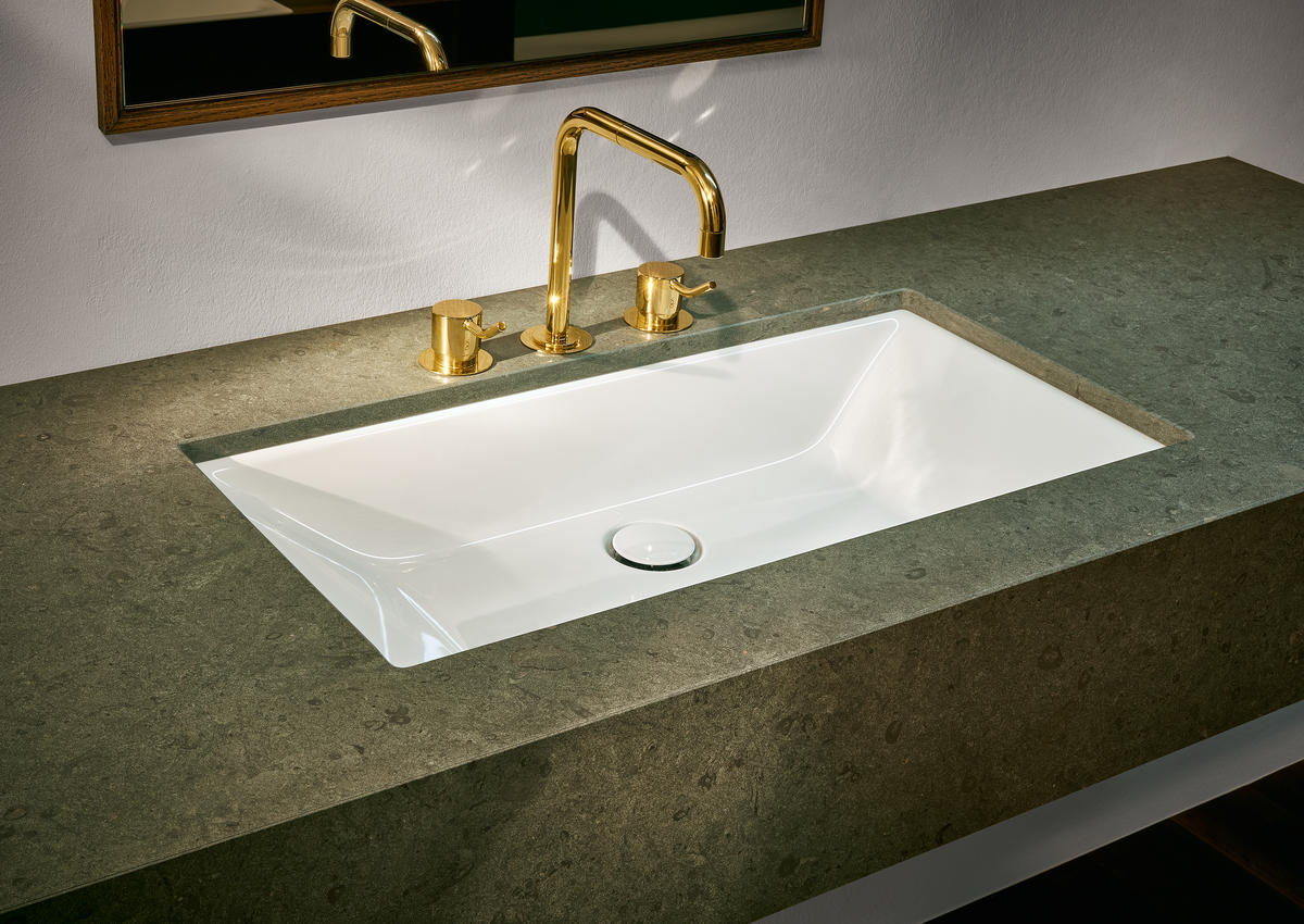
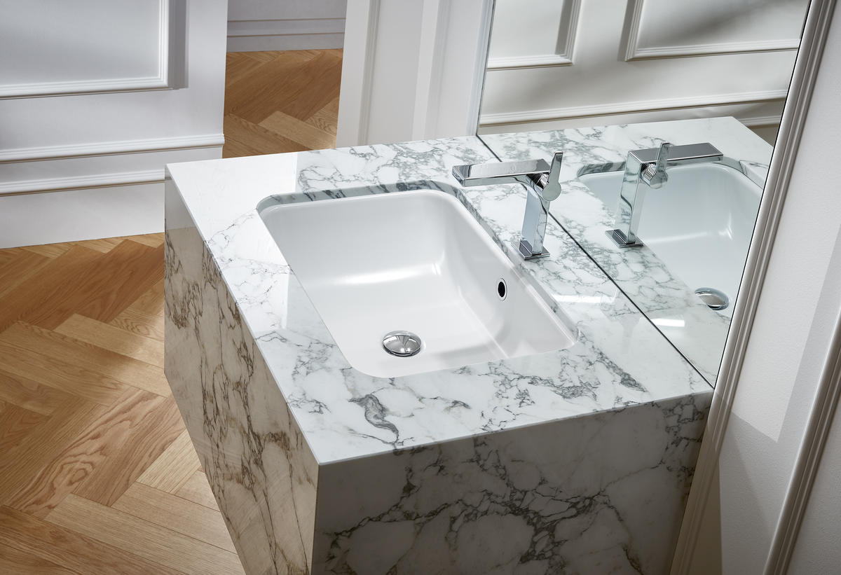
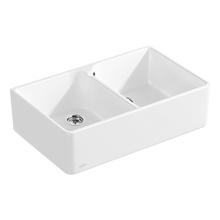
A square into a cuboid: that’s consistent formal severity. The washbasin BetteLoft acts against this in the play with a conically tapered basin. The rounded corners of BetteOne also cancel out the hard aesthetic of the floating marble block.

